Black and Hispanic Voucher Households Live in Higher-Poverty Neighborhoods Than Their White Counterparts
Sep 16, 2024
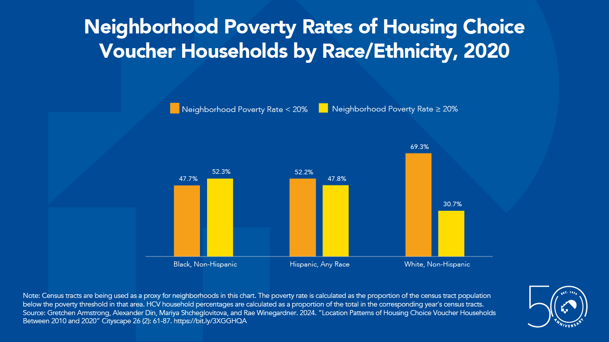
Note: Census tracts are being used as a proxy for neighborhoods in this chart. The poverty rate is calculated as the proportion of the census tract population below the poverty threshold in that area. HCV household percentages are calculated as a proportion of the total in the corresponding year’s census tracts.
Source: Gretchen Armstrong, Alexander Din, Mariya Shcheglovitova, and Rae Winegardner. 2024. “Location Patterns of Housing Choice Voucher Households Between 2010 and 2020” Cityscape 26 (2): 61-87. https://bit.ly/3XGGHQA